
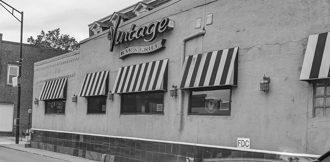
For this project, we were asked to rebrand an existing business of our choice. The brief was to create a fresh identity that reflects the core values of the brand while showing clear, creative thinking and strong visual execution. I chose to rebrand Vintage, a local bar and grill that I felt had a lot of personality—but a visual identity that didn’t quite match.
The existing branding felt outdated and generic, especially for a place with so many glowing reviews about its atmosphere and food. I wanted to create something that felt more intentional and aligned with the venue’s name and the experience it offers. The goal was to give Vintage a more cohesive and visually appealing brand that still felt approachable and familiar to its loyal customers.
Design Approach
My design process started with research. I read through dozens of reviews and looked at photos of the space, food, and existing signage. Customers consistently mentioned the friendly staff, the quality of the food, and the “cozy old-school” atmosphere. Many talked about it as a hidden gem—a place that’s welcoming, lived-in, and full of charm. I used these insights as a foundation for my design direction.
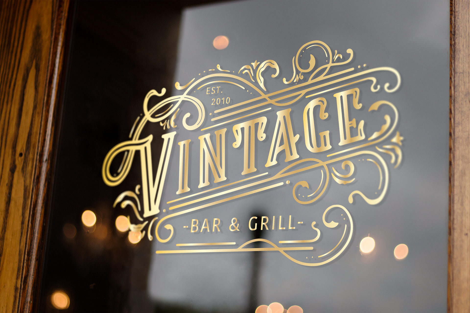
To reflect the name Vintage and the community vibe, I created a logo using my own handwritten typography. I wanted it to feel personal and handcrafted—something that could have been painted on a sign years ago but still feels relevant today. The handwritten quality of the logo means it isn’t perfectly uniform, which gives it a more personal and approachable feel. It adds character and warmth, reflecting the human side of the business—especially since the owners are so involved and present at the venue.

Colour & Typography Choices
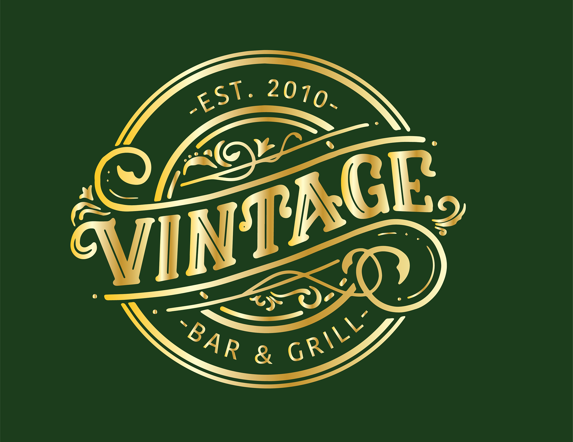
The colour palette features rich gold and deep green tones. Gold adds a sense of tradition and timelessness, while green feels grounded, warm, and connected to the idea of a neighbourhood spot. I also created a black version of the logo for use in more practical or subtle applications. These colours were chosen to be versatile but still evoke a nostalgic yet inviting tone.
For typography, I paired the handwritten logo with a clean sans-serif typeface for headings and body text. This helped strike a balance between the vintage-inspired personality and a more modern, legible layout—especially useful for menus or signage where clarity is important.

Logo Variations & Flexibility
To make sure the branding would work across different materials, I designed a round logo variation. This could be used on merchandise, coasters or social media icons. It maintains the same feel but is adapted for smaller or more compact formats, ensuring brand consistency without sacrificing flexibility.


Outcome & Reflection
Even though this wasn’t a real client project, I approached it with the same mindset—thinking through how the branding would live in the real world. My choices were all grounded in feedback from actual customers, the feel of the physical space, and the desire to give Vintage a visual identity that matched what people already love about it.
Overall, this rebrand was a chance to practise creating a brand system that’s not only visually strong but also emotionally resonant. It taught me how important it is to listen to what people value in a business and translate that into design decisions that feel authentic and effective.