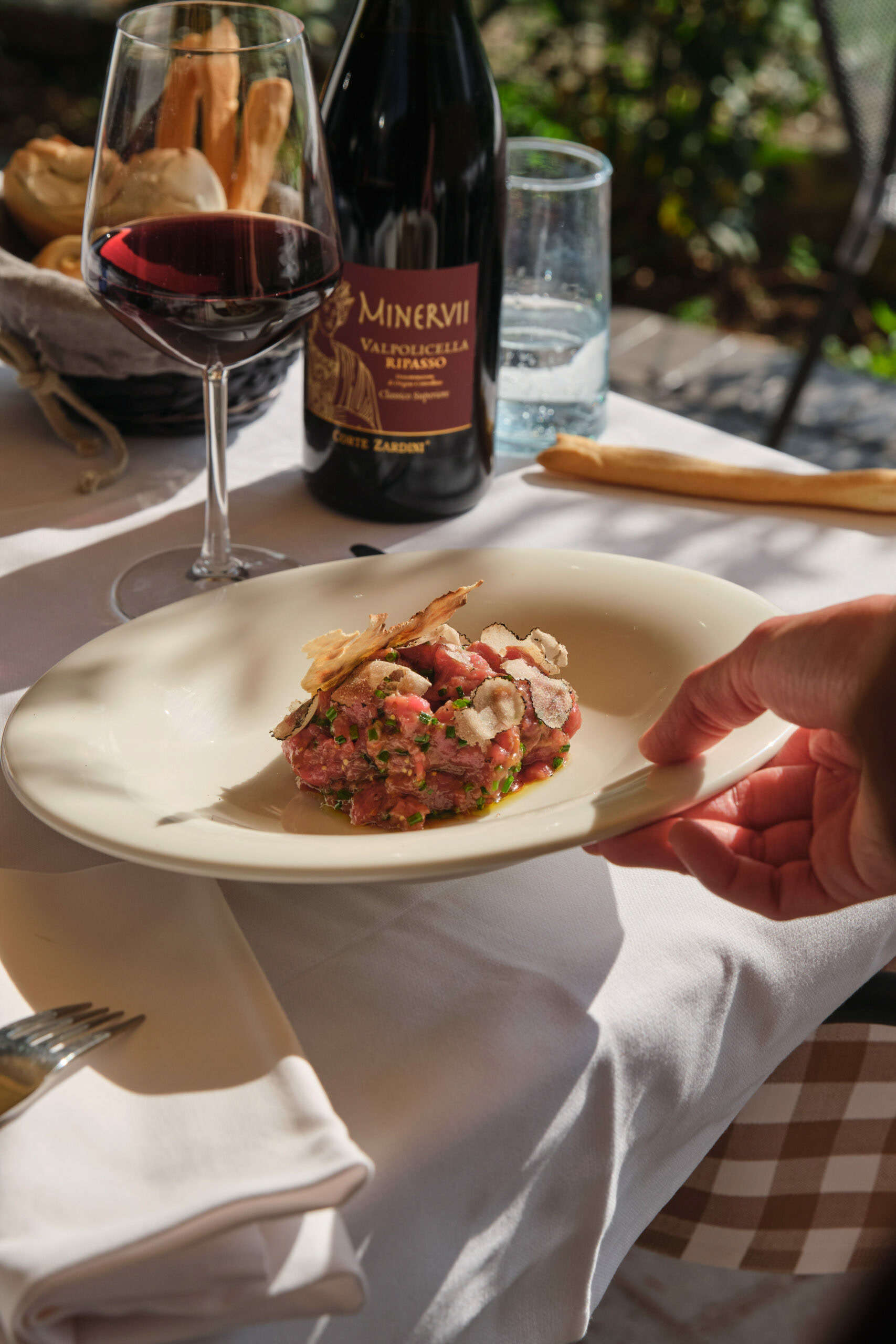
For this project, I collaborated with another design student to create a logo for a real client — Antica Osteria Paverno, a rustic Italian restaurant located in Valpolicella, Italy. The restaurant had recently reopened and needed a new visual identity that captured its character and honoured its long-standing reputation for seasonal Venetian cuisine and warm hospitality.
Client & Brief
The client wanted a logo that would represent both the restaurant’s rich heritage and its modern revival. Our task was to design a logo that aligned with the restaurant's existing atmosphere, menu, and values — something timeless yet fresh.
Approach & Research
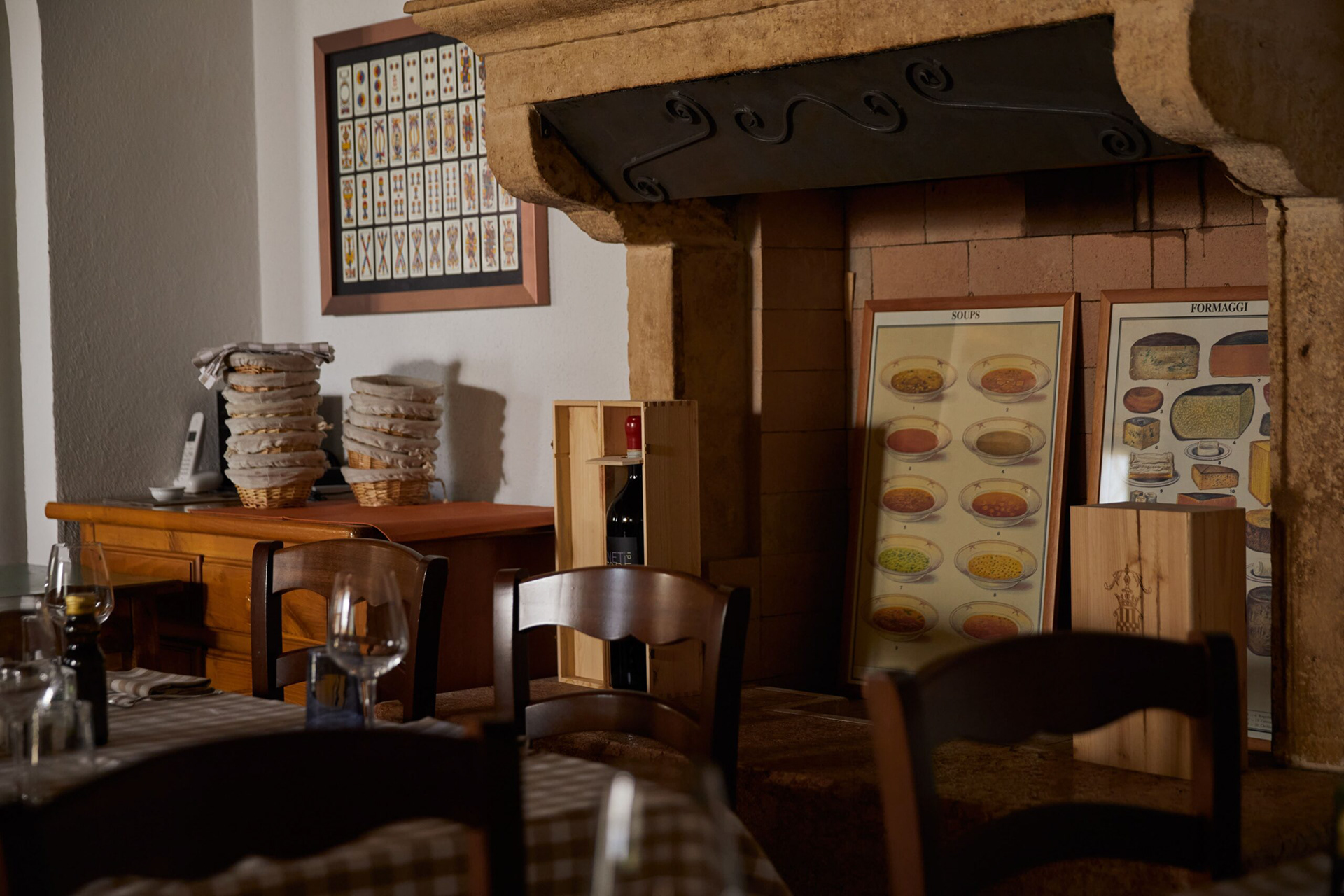
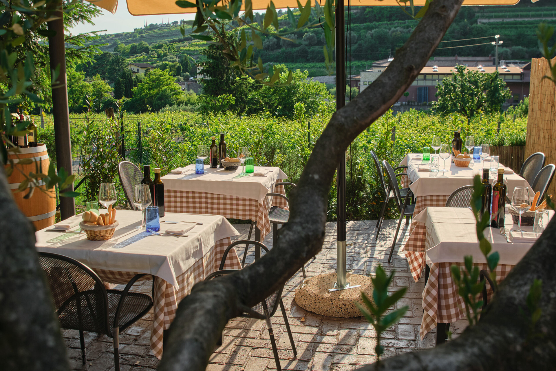
We began the project by researching the restaurant itself — looking into its history, venue, and menu offerings. This helped us understand its culinary focus, traditional ambiance, and the type of experience it offers diners. From there, we developed a visual direction that respected the authentic, rustic feel of the space while still feeling updated and adaptable to modern branding needs.
Design Solution
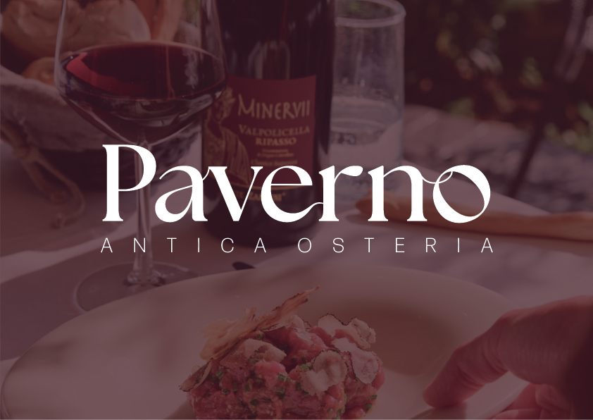
We selected a serif typeface for "Paverno" that had a modern, refined feel, combining timelessness with a look that’s in line with current design trends. This was paired with a sans serif typeface for the supporting text, creating contrast and reinforcing the balance between old and new.
We introduced a subtle visual feature: the “o” in “Paverno” was tilted to resemble a grape, referencing the restaurant’s connection to wine culture and local vineyards. We also incorporated hand-drawn vine details to enhance the logo’s artisanal and rustic qualities.
We chose white as the primary logo colour to maintain a clean, modern aesthetic the client was after. It also provides versatility for various applications like signage, menus, and digital platforms.
Outcome & Reflection
The final design strikes a balance between tradition and modernity, aligning with the restaurant’s culinary values and visual preferences. The client was pleased with the outcome, and it was a rewarding experience in terms of client collaboration, visual storytelling, and applying typography in a meaningful, brand-driven way.