For this project, we were asked to identify and describe an existing packaged product category on the market that could offer more effective, innovative, and meaningful consumer experiences through its packaging. Based on research and observations, we were then required to develop several ideas that would lead to a redesign of the chosen product’s packaging. I chose coffee pods as the focus of my project due to their widespread use and environmental challenges related to single-use packaging.
CLIENT & CONCEPT
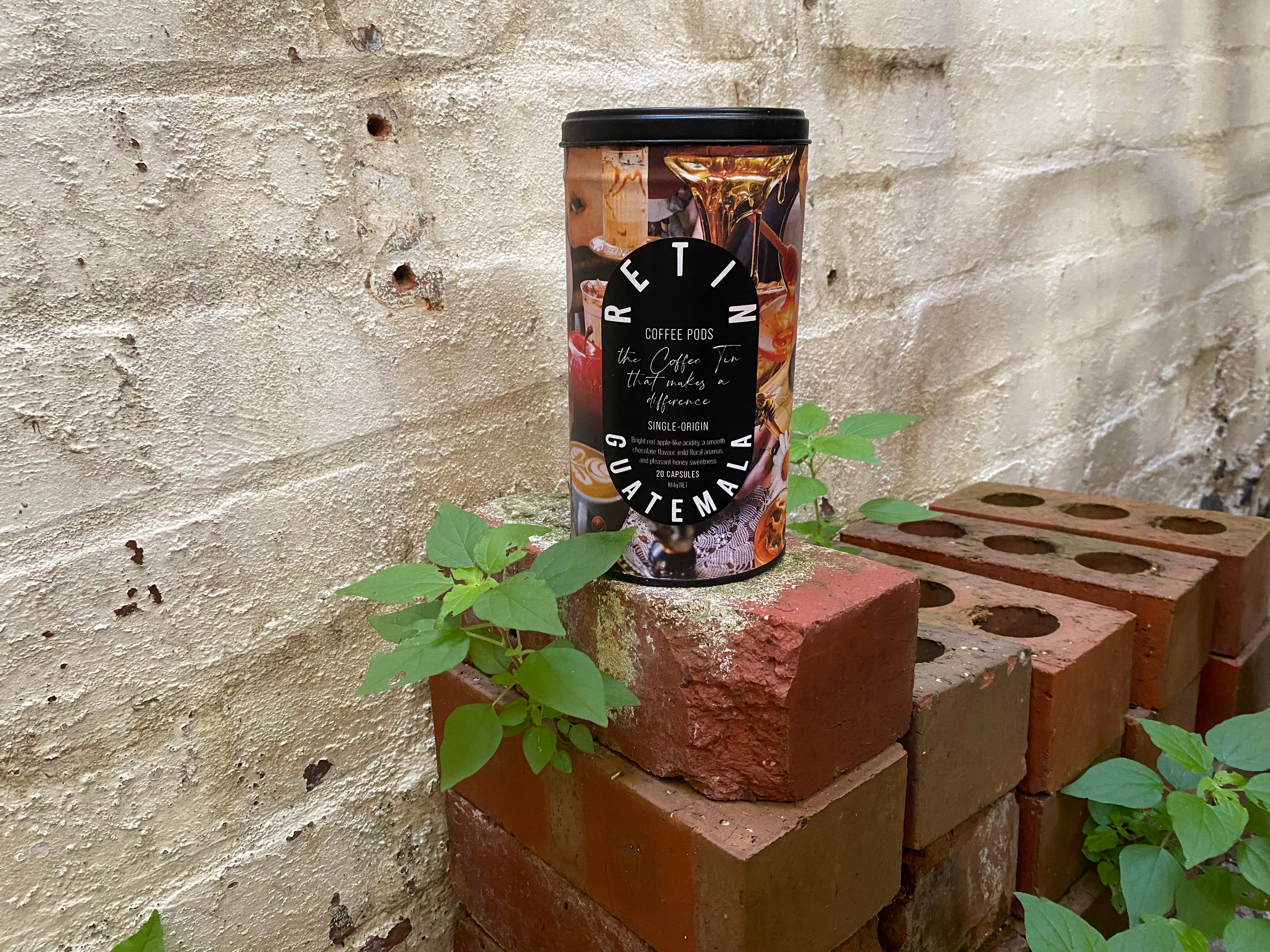
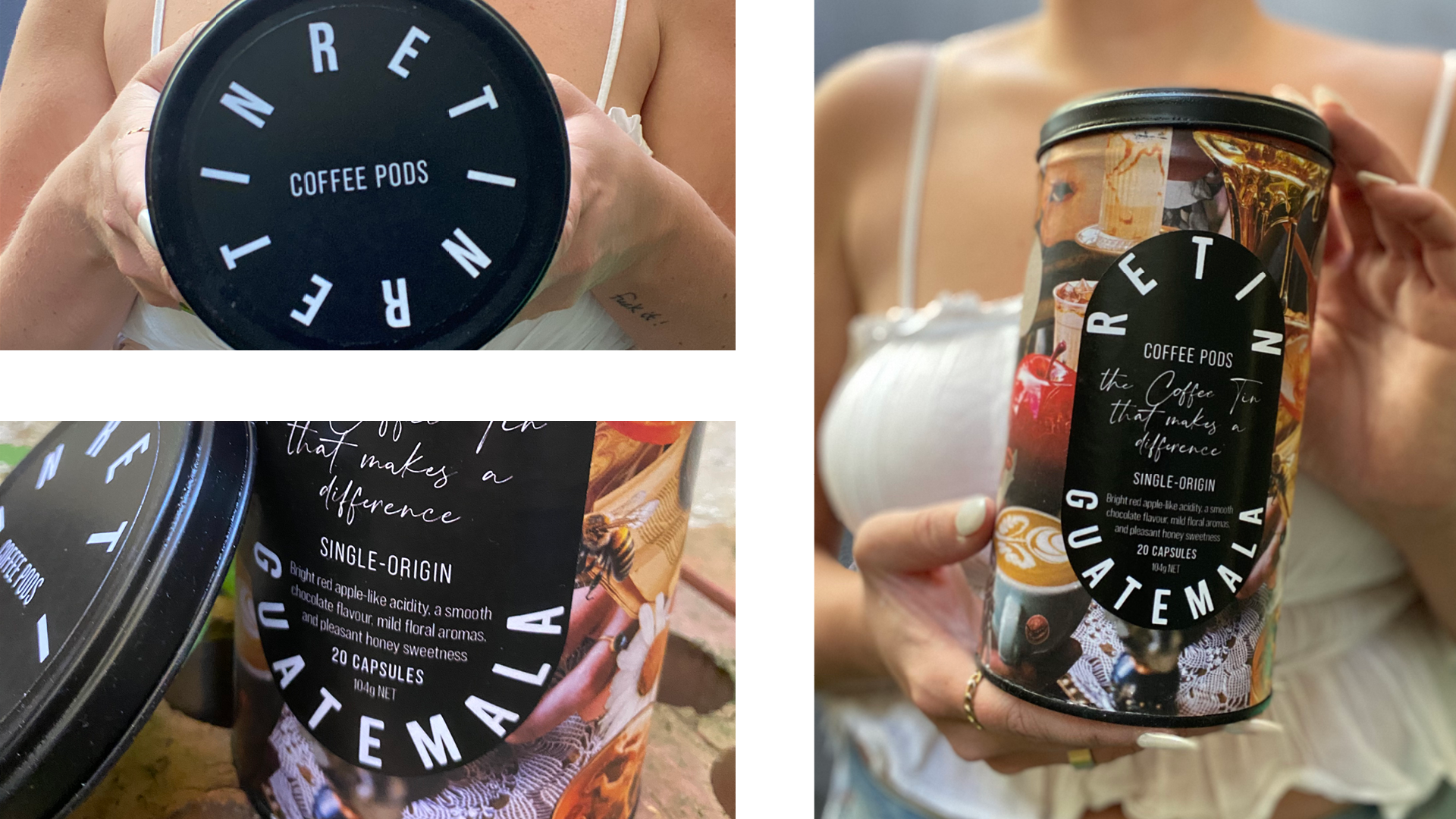
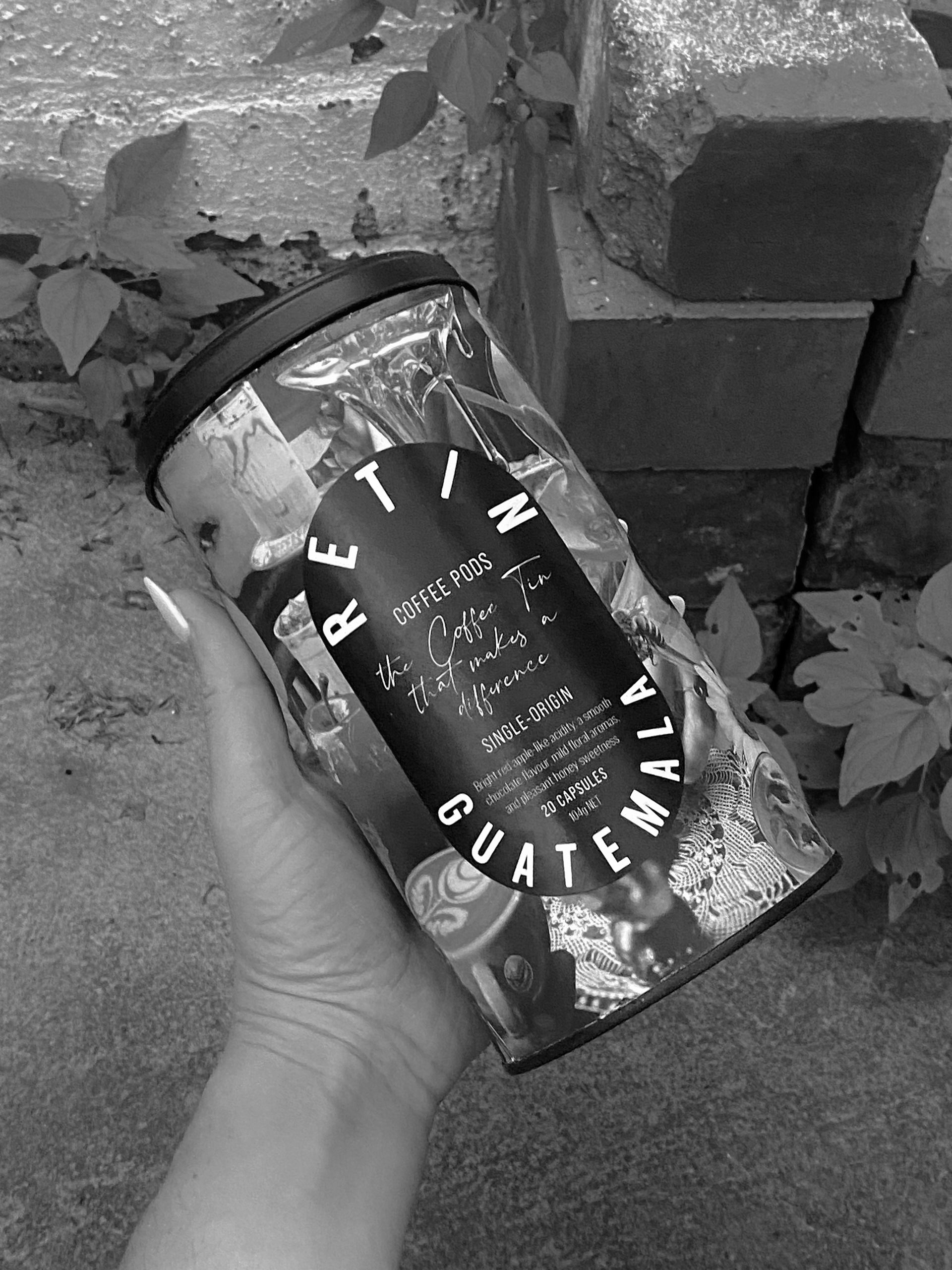
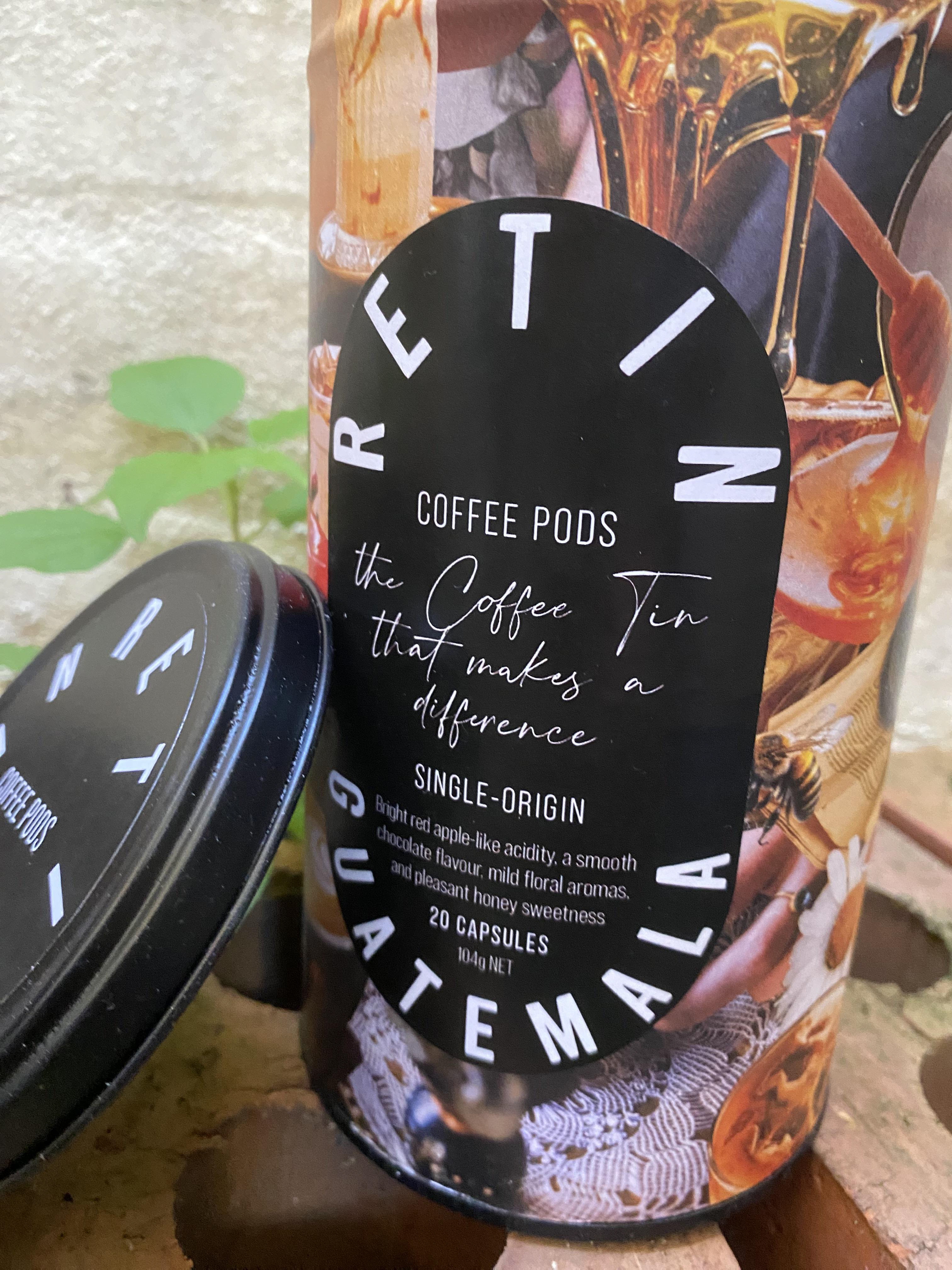
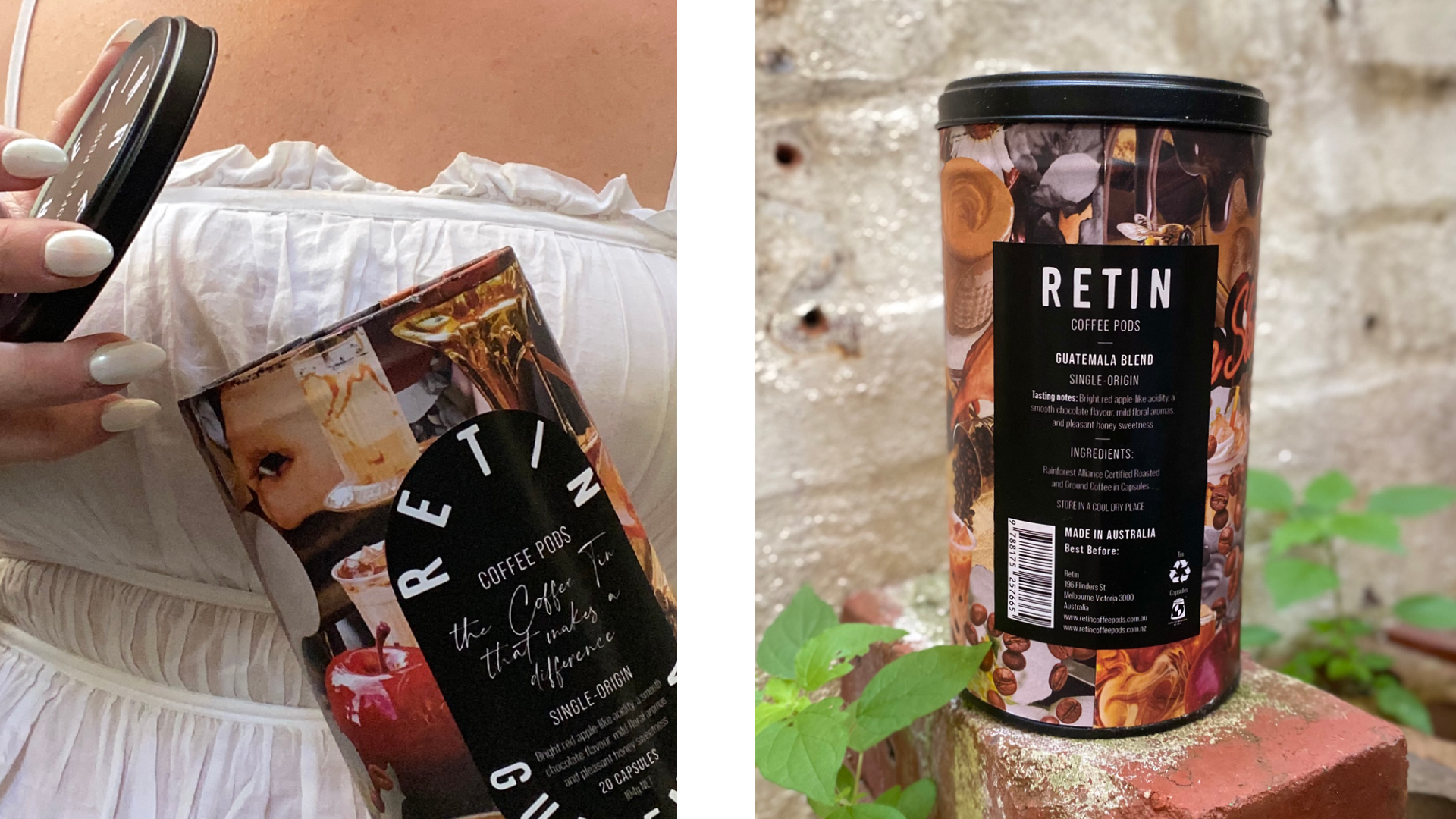
Without a real client, I created a fictional brand called ReTin, focused on producing aluminium tins designed to hold 20 coffee pods. The tins feature collage-style prints inspired by coffee flavours, using natural, earthy tones to reflect the product’s artisanal and eco-conscious positioning. The concept balances convenience and aesthetics, aiming to encourage pod reuse and reduce single-use waste.
PURPOSE OF THE PROJECT
The project aimed to explore sustainable packaging options that meet consumer expectations for both design and environmental impact. It also sought to show how packaging can be part of the coffee experience, helping customers connect visually with flavours while promoting reusability and reducing waste.
DESIGN APPROACH
I started by auditing current coffee pod packaging, paying attention to materials, shapes, and how brands communicate their messages visually. I found that most pods come in single-use containers with limited sustainable options for storage. This insight led me to design a reusable tin printed with plant-based inks and accented with a hand-drawn logo, creating a premium look that reflects eco-friendly values.
MATERIALS, PROCESSES & TECHNIQUES
The tin is made from recycled aluminium, chosen for its durability and recyclability. I used biodegradable, plant-based inks for the printed designs and FSC-certified paper labels printed with soy-based inks, fixed with natural adhesives. Protective coatings are biodegradable, maintaining design integrity without plastic. The packaging materials were selected to ensure the entire product is as sustainable and eco-friendly as possible.

Colour, Typography & Semiotics
ReTin features a minimalist black-and-white palette accented with vibrant colours that reflect each coffee flavour. Hand-traced typography inspired by Bebas gives the brand an authentic, organic feel, supported by clean fonts like Bebas Neue Pro and Crimson Foam. Flavour-inspired collage patterns visually communicate each blend, while the natural colours and handwritten logo highlight ReTin’s sustainable, artisanal values—making the packaging distinctive and meaningful.
Outcomes & Reflection
The result is a reusable coffee pod storage tin that combines functionality, style, and environmental responsibility. ReTin encourages consumers to rethink single-use packaging and adopt more sustainable habits. This project provided valuable insight into how design choices can support sustainability while still offering a high-quality, visually attractive product that fits into everyday life.